The Chatbot Escape Hatch
When a text box replaces a product, something has gone wrong


Imagine walking into a restaurant. There’s no menu. No specials on a chalkboard. No host walking you through the experience. Just a waiter who says, “Tell me what you want, and I’ll see what I can do.”
You pause. You were craving something warm. Comforting. You say, “I don’t know, something with noodles, not too spicy, but not bland either.” The waiter nods, then asks if you want broth or stir-fry. You say either. He asks if you eat shellfish. You say yes, but not tonight. He asks rice noodles or wheat. You realize you’ve started doing all the work the menu would have done for you. Eventually a plate arrives. It’s fine. It’s not quite what you came in for, and you’re not sure if that’s the kitchen’s fault or yours.
That’s most chatbot interface on the market right now.
This isn’t about Claude, ChatGPT, Gemini, etc. Those products earn their chat surface because the space of user goals is open-ended in a way no menu could ever cover. You can’t put “help me draft a memo,” “explain this contract,” and “plan a road trip” on the same dropdown.
This piece is about the products on the market that bolted a chat box onto something that should have stayed structured.
Chat Looks Like Flexibility. It’s the Opposite.
Every few years, one interface pattern becomes the thing product teams reach for when they can’t decide what their product is. In 2015, it was the mobile hamburger menu, which hid the fact that nobody had ranked the top-level navigation. In 2018, it was the onboarding tour, which bolted explanations onto screens that should have explained themselves. In 2026, it’s the chatbot.
In theory it sounds great. Natural language is universal. Users can ask for anything. The product becomes open-ended because the surface can handle any request.
The reality is a lot messier. NN/g has been writing about this since the first wave of chatbots in 2018, and the findings still hold. Chatbots guide users through linear flows and fall apart whenever anyone steps off them. A 2024 Clutch survey found that 49 percent of consumers describe chatbots as frustrating, 87 percent say chatbots do not fully resolve their issue without human help, and 45 percent say they get irrelevant answers. Those aren’t UX bugs. That’s the interface telling the user, “Figure out what I can do, because I’m not tell you”
A chat surface doesn’t remove complexity. It transfers it. The designer stops making decisions about hierarchy, defaults, and which actions matter. The user has to guess. And most users don’t want to guess. They want to see what’s possible and pick from it.
What Teams Are Really Doing When They Ship a Chat UI
A text box is what you ship when the product team can’t agree on what the product is for.
How does this happen, exactly? A team starts with ten use cases. Half of them conflict. Prioritization conversations drag on. Someone in the room says, “what if we just let users ask for what they need?” Everyone nods. The chatbot ships. The hard conversation about which two use cases actually matter never happens.
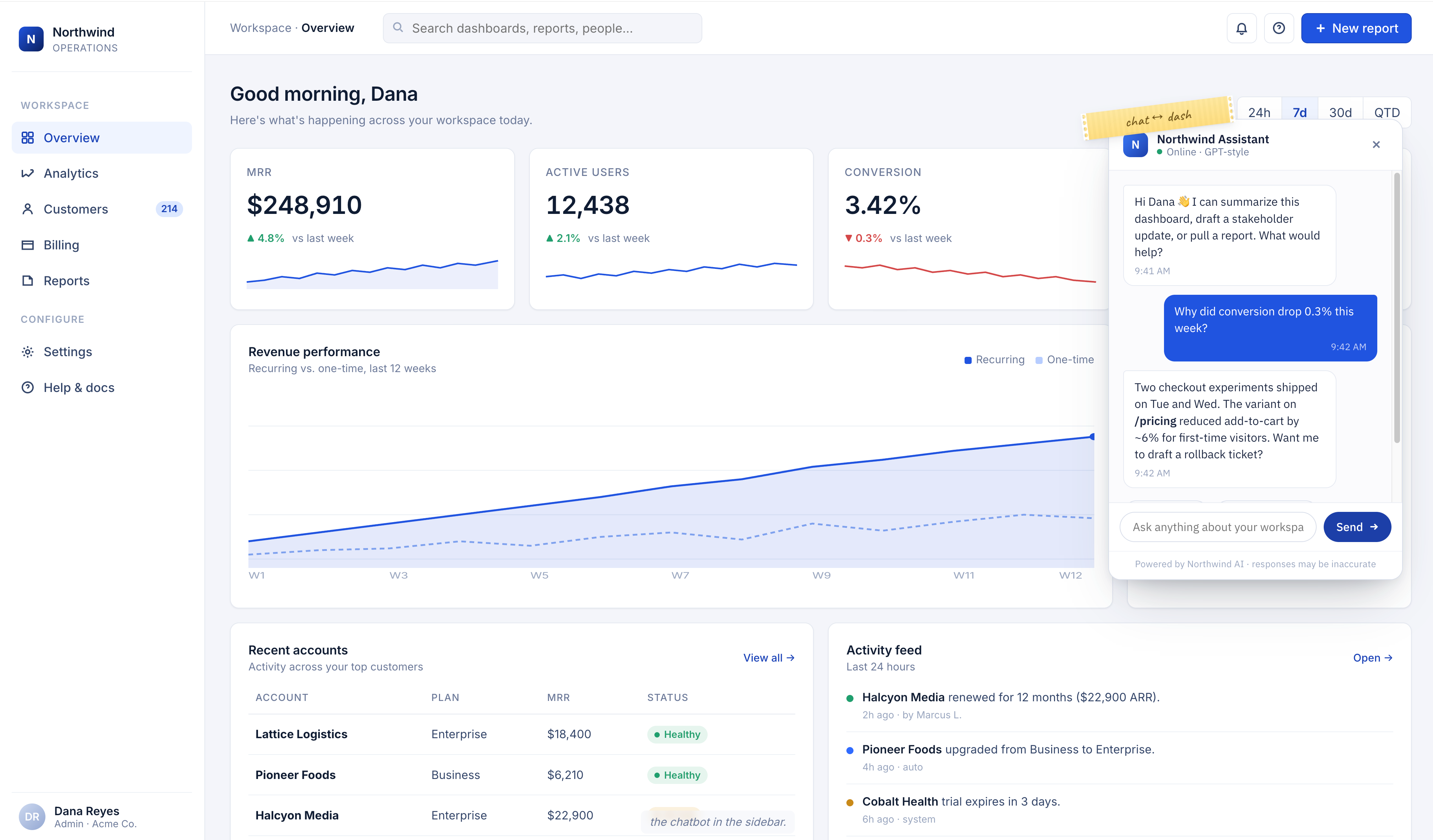
I sat in on a product review a few months ago that played out almost exactly like that. The team had built an AI assistant that could, in theory, do everything the rest of the product did. In practice, the power users were quietly ignoring it and going back to the menus and buttons they already knew. New users were spending their first few days learning how to phrase prompts that gave consistent results. The support backlog kept growing. The chatbot stayed in the sidebar like a piece of furniture nobody loved.
Chat becomes a way for a team to avoid picking a primary job-to-be-done. It postpones the question. The box is always empty, which means the box is always a promise instead of a product.
The Information Cost
There’s a hidden tax on chat interfaces that rarely shows up in product specs. I’ve been calling it the articulation tax.
Every time a user has to type what they want, they have to first know what they want, then translate it into words the model can understand, then read the response and decide if it’s what they asked for. Compare that to a dashboard with a labeled button that says “Generate quarterly report.” One click. No ambiguity. No translation.
Good products do the translation work ahead of time. They figure out which jobs matter, give them clear names, and put them where users can find them without typing. Bad products slide that work onto the user and call it empowerment.
This matters even more when the product has a narrow job. A chatbot layered onto a scheduling app, a note-taking app, or an expense tracker almost never outperforms the buttons that are already there. You want to book a meeting, not negotiate with a bot about what booking a meeting means.
When Chat Earns Its Place
None of this is an argument against conversational interfaces in every case. Chat is the right surface when three things are true.
First, the space of possible user goals is so large that no menu could ever contain it. A general-purpose assistant, a coding pair-programmer, or an open-ended writing tool all qualify. You can’t list every possible question someone might ask about a legal document.
Second, the user already has a clear intent and just needs help executing it. Chat works as an exit, not an entrance. Once someone knows what they want, typing it out can be faster than clicking through menus.
Third, the model behind the chat is capable of acting, not just answering. A chatbot that only returns text is usually a worse version of search. A chat surface that can take actions, modify state, and return results that integrate with the rest of the product earns its keep.
Here’s how I check. Ask what the user’s second action is going to be. If they have to re-type their context in a new prompt, the chat is a dead end. If they can move naturally into the rest of the product, the chat is a proper front door.
The Product Teams Who Got This Right Worked Harder, Not Less
The products getting this right use AI underneath a surface that still looks like a product. Notion’s AI features sit inside the block editor rather than replacing it. Linear’s AI helps you draft issues in the context of an actual issue, not a blank prompt. Granola’s meeting notes app could have shipped as a chatbot that summarizes meetings on demand. Instead the AI augments the notes you take in real time, leaving the editor itself intact.
These teams could have shipped a chatbot. They chose not to. They did the harder work of asking which jobs matter, ranking them, and building surfaces that let users do those jobs without typing paragraphs.
What looks like restraint is decision-making. Every default they shipped is a decision. So is every place they chose not to add chat. The teams that avoid the chat trap are the ones who can tolerate the discomfort of picking what their product is, instead of hiding behind an input field that promises everything and commits to nothing.
Putting This Into Practice
If you’re staring at a chat-first design and wondering whether you fell into the trap, ask a few questions.
When a user opens the product for the first time, can they tell what it does without typing anything? If not, the chat is carrying too much weight. When a new user succeeds at their first task, did they discover the capability from the interface, or did they already have to know it existed? If it’s the second, the chat is hiding the product. When power users return for the fifth time, are they still typing, or have they migrated to shortcuts, buttons, and templates? If they’ve migrated, the chat was a crutch, not a destination.
Chat is not the villain. The villain is using chat to avoid design.
Back to the Restaurant
Let’s return to the restaurant with no menu.
The best restaurants have menus. A menu is the chef telling you what they’re confident about, what they’ve decided to make well, what they’ve committed to put in front of you. You’re there because you trusted them to have an opinion.
The worst version of AI product design is the restaurant that outsourced that opinion to you. “Tell us what you want” sounds generous. Most of the time, it’s abdication in a nice font.
Your product can do enormous things underneath. That’s a good thing. But the surface should tell users what you’ve decided to be great at. If the first thing they see is an empty text box, they’re going to walk out, or worse, they’re going to order the pad see ew and wonder if that was really what they came in for.